Sunday, February 3, 2008

Design Agency- mediaBOOM

mediaBOOM
interactive design and development
http://www.mediaboom.com/main.html


mediaBOOM is a Webby Award winning interactive agency that combines world-class design with cutting-edge technologies in order to deliver engaging online experiences.

Their team of creative and technical experts immerse themselves into each project and work tirelessly to build the client's brand.


They provide services such as:
  • WEBSITE DESIGN and DEVELOPMENT
  • APPLICATION/DATABASE DEVELOPMENT
  • GAMES
  • 3D ANIMATION
  • EMAIL MARKETING
  • SEARCH ENGINE OPTIMIZATION
  • GRAPHIC DESIGN
  • ILLUSTRATION
  • LOGO DESIGN/BRAND IDENTITY
  • PHOTOGRAPHY
  • SOUND DESIGN

The website has show a very good art direction, consistent color schemes which brings out the mood, feelings thus and so. Their website with good illustrations, flash, layout and information planning wise showed that they are capable to come out with a good design for the clients.

Moodboard

Saturday, February 2, 2008

Websites with good typo and color schemes

Hansung University
http://ct.hansung.ac.kr/


Scribble that greatly match with the interesting illustrations. It's creative yet everything organized. The color schemes really make everything got into the mood. The art direction is cool really.


Some colorful navigations over white background, and also the animated rollover effect. Just like what Fujifilm are doing. Printed out our colorful moment, as it's animated.. Not much special typo except their name "FUJIFILM" which grabbed attentions a lot. At least proper hierarchy and good arrangement.


Converse
http://www.conversekorea.com/converse_100th/ >


Good typography matching the style of converse which nothing much formal but "us" to make things special and the only one. It's 100th anniversary, hence for the main page they use the grayish mood with black to create the mood to tell the audience that they actually been through a long go up to now.


What is M to U?
http://www.whatismtou.com/

The lighting effect has created some sort of mysterious feelings. The content box stands out because of the usage of em more eye cathching colors. The typo is just irritatingly perfect. Eventhough it consists of 4different font type but it just match well (because they all brings the same feelings of fun, playful, young, happy.... thus and so)


Baskin Robbins
http://www.baskinrobbins.com/


Well this website of Baskin Robbins has really created the mood with good color schemes and of course appropriate typo. Overall it gives us em feelings of having happy time, it's lighthearted like how ice-cream works. The images with pleasant descriptions are great. It's a lovely sweet websites. It's gonna masterdom the ice-cream lovers oOp

Saturday, January 26, 2008

Dbcut Websites Research

01
http://www.tlj.co.kr/


  • Very good illustration, well done in creating and bringing out the mood (soft, relaxing...)
  • The flash thingy makes everything even more interesting.
  • Finest hierarchy and arrangement.
  • It's a unique web design (french style).

02

http://morningcafe.kia.co.kr/intro.html


  • Great illustration, typo which create friendly and artistic feel.
  • Consistency of style and art direction.
  • Kind of collage treatment but it's way more neater.
  • Good color scheme.
  • Layout wise, it's an extraordinary interesting website.
  • Too bad for me doesn't read korean.

03

http://www.crazy4wait.co.kr/main/c_main.html


  • By having a look the montaged images i knew that's a comedy movie.
  • The mood is there. Treatment that show the romantic+comedy+irrational of the movie.
  • Good color scheme that bring the feelings of feminine, simple, romantic, soft...

04

http://www.conversekorea.com/selfFactory/page.asp


  • Amazing typography which perfectly match the style of converse, which "us" as the self factory.
  • The art direction is just cool. Treatment onto the frame looks like the surface of the shoes.
  • Consistent and good hierarchy.
  • Those handwritten words, drawings (notes) makes the image become much more contrast, making the layout interesting.

05

http://www.lottesamkang.com/event/pigbar/brand/default.asp

  • Good that the background with soft colors and white managed to tone down the chocolate brown color above, so that it won't be too much.
  • The flash animation makes the web even much more interesting and interactive.
  • The illustrations is cute and interesting really.
  • Although i doesn't read korean, but i knew that the typography is just match with their product and style. Fun, happy, colorful, such and such.

Sunday, January 20, 2008

Mission Statement

Berjaya Hills Resort (formerly Bukit Tinggi Resort) is a hill resort in Bukit Tinggi, Pahang, Malaysia near Genting Highlands. It is well-known for its French-themed village, Colmar Tropicale.

Berjaya Hills captures the essence of the different cultures of the world in a single unique destination! Just 40 minutes' drive from Kuala Lumpur and 10km off the East-West Karak Highway, Berjaya Hills covers 16,000 acres of rugged hills and mountains crowned with lush tropical rainforests. At 2,700 - 3,500 feet above sea level, the air is cool, fresh and rejuvenating. The perfect destination with a world of difference!

Its many attractions includes Colmar Tropicale - a French Themed Resort, Berjaya Hills Golf & Country Club, Japanese Village and the Rabbit & Deer Farm.

Mission Statement / Site Objective
Improve the quality of the web as in the design, images, content planning such and such which satisfy customer needs. The primary purpose must always be to uphold the interests of traveler and wayfarer, whatever the mission statement. Find out who are the "client" and design a website which is suitable. Increase more customer by having a good webpage.

Goals
  • A fast loading website with easy navigation.
  • Well management of information.
  • Nice images with great explaination to promote the beauty of berjaya hills to attract more wayfarer and traveler.
  • Booking online to increase online sales. Make it a safety and dependable online purchase system.
  • The "keep me updated!" feature will be maintained. I think it's good in order to convert short term customer to be long term customer.

Target Audience

Analyses on Berjaya Hills & the competitors websites

Research and Analyses on:
Berjaya Hills
http://www.berjayahills.com/


  • It's a place where the air is cool, fresh and rejuvenating. But the website doesn't give much feelings on that.
  • Other than that the color mood is not consistent.
  • The layout which center on and squarish boxy is pretty boring.
  • Those image doesn't give us the fresh, wonder holiday feelings of berjaya hills. Hence it's not attractive enough to grab the attention of the audience. It doesn't make me feel like going to there.
  • On the other side, the "keep me updated" feature keep the wayfarer and guests updated on the hottest and latest at Berjaya Hills which is good. It convert short term customer to long term customer.
  • Rich in content, convenient as in corporate but just that the design and layout itself is boring.

Research and Analyses on 3competitors:
Awana Hotels and Resort
http://www.awana.com.my/home.asp


  • Interesting banner image that gave us the feelings of holiday, relaxing, perfect destination for a weekend getaway either with love ones, friends or family.
  • Some eliments applied to make the layout not so squarish. The flower motifs at the background match well with the style logo of awana.
  • Rich and well planning of its content.
  • Promotions, packages, and online booking to save 15% on room rates are attractive and make the audience feel worthy and being respect. It increase online sales.
  • The option to choose either english or chinese features makes the target audience even wider and more convenient.
  • Overall looks ennoblement profession yet worthy.


Cinta Sayang Golf and Country Resort
http://www.cinta-sayang.com.my/


  • Rich and well planning on it's content. Everything catogorize nicely.
  • One thing i feel interesting is that the fonts. Handwritten fonts which brings fun, happiness, holiday such and such feelings but yet corporate.
  • Interesting and attractive images to grab attention of audience.
  • Even a division of daily fun activities that pull in much more guests.
  • The disadvantage is that i could find the feature of online booking which i think it's very much important.

Tropicana Golf and Country Club
http://www.tropicanagolf.com/index.html


  • Attractive images where the beauty of this place showed.
  • Event calendar, latest promotions and also up coming at tropicana info on the main page which i think is good, convenient, attraction to both the members and non-members.
  • They even have photo gallery of tropicana photography contest 2006 which promoting the place yet bring the fun to the guests who like to take photograph.
  • The objectives of giving information and reading pleasure, they have maintained a collection of the latest as well as archived information on a variety of news topics, events and promotions related to Tropicana Golf & Country Resort.
  • It convert member to become long term member and it even attract people to become member.

Saturday, January 12, 2008

Research on Corporate Website

Edwards Dunlopaper
http://www.edpaper.com.au/index.php

All the information you need to know about Edwards Dunlop which continues to build its product offering and operational capabilities.


  • Now an equity partner in IGEPA International GmbH, Edwards Dunlop is in the company of some of the best paper merchants in the world representing strong brands such as Maxi.
  • The broad range of suppliers provide the product range that has allowed the company to support not only its traditional print customers but introduce specialist services for the fast growing segments of quickprint, digital printing, office stationery and advertising and design.
  • The packaging division has expanded to include Australia wide marketing to the converting and food industry.
  • In office products the well known Victory and Double A brands are distributed exclusively.
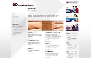
  • The website which is neat and clean in design greatly match with their product (paper) as they do not need a complicated congested ones.
  • The main reason of having a corporate website is to build its product offering and operational capabilities. Giving education at the same time promoting their product.
  • They are actually showing and telling the audience that they are pro on the other hand confident, knowing well of their product.


Pizza Hut.my

http://www.pizzahut.com.my/

All the information you need to know about Pizza Hut included menu, highlights and even online ordering.


  • Pizza Hut is the world's largest pizza restaurant chain and is a subsidiary of Yum! Brands, Inc., whose restaurants total approximately 34,000 restaurants, delivery-carry out units, and kiosks in 100 countries specializing in American-style pizza along with side dishes.
  • The most commonly sold food at the restaurants is pizza, which usually comes in four different sizes including Personal Pan (which is an individual serving), Small, Medium and Large, although most stores have done away with the small size. They come in a variety of toppings, including "specialty" styles, which consists of Meat Lovers, Pepperoni Lovers, Cheese Lovers, Veggie Lovers, Double Cheeseburger, Supreme, and Super Supreme, which is Pizza Hut's most expensive pizza. Pan Pizza has a thicker crust than most other commercially available pizzas. Unlike most of Pizza Hut's competitors (such as Domino 's deep dish or Shakey's pizza)

Malaysia
In Malaysia, Pizza Hut offers toppings that do not contain pork to comply with the Muslim majority; many menu items replace pork with chicken. There are also different toppings that reflects the country's cuisine including satay, a Malaysian form of spiced meat similar to a Shish kebab.

  • pizzahut.com.my is a commercial website which is well planned, i can get the info that i want immediately.
  • The objective to make the audience getting much more familiar, getting know bout their latest promotion, information about their menu is really successful.
  • On the other hand other than calling to make an order, the ordering online function is really cool and convenient. This features really makes them even being more advanced compared to the other competitors. Increase online sales.
  • It's a fast loading and easy navigating website.
  • Friendly, safety and dependable online purchase system.


Nike
http://www.nikebiz.com/


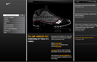
Introducing the AIR JORDAN XX3, Nike's first high-performance basketball shoe designed with the environment in mind.


  • Nike, Inc. is a publicly traded sportswear and equipment maker based in the United States. It is the world's leading supplier of athletic shoes, apparel and sports equipment. As of 2008, it employed over 30,000 people world-wide.
  • Nike markets its products under its own brand as well as Nike Golf, Nike Pro, Nike+, Air Jordan, Nike Skateboarding, Team Starter. In addition to manufacturing sportswear and equipment, the company operates retail stores under the Niketown name. Nike sponsors many high profile athletes and sports teams around the world, with the highly recognized trademarks of "Just do it" and the Swoosh logo.
  • Nike's marketing strategy is an important component of the company's success. Nike is positioned as a premium-brand, selling well-designed and expensive products. Nike lures customers with a marketing strategy centering around a brand image which is attained by distinctive logo and the advertising slogan: "Just do it". Nike promotes its products by sponsorship agreements with celebrity athletes, professional teams and college athletic teams.
  • This corporate website has show the elegant, high performance, classy, successful products to the audience.
  • But the main focus will be getting more investor, partnership. Being supplier to make their brand and product even wider in marketing.