Sunday, February 3, 2008

Design Agency- mediaBOOM

mediaBOOM
interactive design and development
http://www.mediaboom.com/main.html


mediaBOOM is a Webby Award winning interactive agency that combines world-class design with cutting-edge technologies in order to deliver engaging online experiences.

Their team of creative and technical experts immerse themselves into each project and work tirelessly to build the client's brand.


They provide services such as:
  • WEBSITE DESIGN and DEVELOPMENT
  • APPLICATION/DATABASE DEVELOPMENT
  • GAMES
  • 3D ANIMATION
  • EMAIL MARKETING
  • SEARCH ENGINE OPTIMIZATION
  • GRAPHIC DESIGN
  • ILLUSTRATION
  • LOGO DESIGN/BRAND IDENTITY
  • PHOTOGRAPHY
  • SOUND DESIGN

The website has show a very good art direction, consistent color schemes which brings out the mood, feelings thus and so. Their website with good illustrations, flash, layout and information planning wise showed that they are capable to come out with a good design for the clients.

Moodboard

Saturday, February 2, 2008

Websites with good typo and color schemes

Hansung University
http://ct.hansung.ac.kr/


Scribble that greatly match with the interesting illustrations. It's creative yet everything organized. The color schemes really make everything got into the mood. The art direction is cool really.


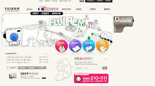
Some colorful navigations over white background, and also the animated rollover effect. Just like what Fujifilm are doing. Printed out our colorful moment, as it's animated.. Not much special typo except their name "FUJIFILM" which grabbed attentions a lot. At least proper hierarchy and good arrangement.


Converse
http://www.conversekorea.com/converse_100th/ >


Good typography matching the style of converse which nothing much formal but "us" to make things special and the only one. It's 100th anniversary, hence for the main page they use the grayish mood with black to create the mood to tell the audience that they actually been through a long go up to now.


What is M to U?
http://www.whatismtou.com/

The lighting effect has created some sort of mysterious feelings. The content box stands out because of the usage of em more eye cathching colors. The typo is just irritatingly perfect. Eventhough it consists of 4different font type but it just match well (because they all brings the same feelings of fun, playful, young, happy.... thus and so)


Baskin Robbins
http://www.baskinrobbins.com/


Well this website of Baskin Robbins has really created the mood with good color schemes and of course appropriate typo. Overall it gives us em feelings of having happy time, it's lighthearted like how ice-cream works. The images with pleasant descriptions are great. It's a lovely sweet websites. It's gonna masterdom the ice-cream lovers oOp